Description
The U.S. Sector strategy allocates dynamically between four long U.S. sector sub-strategies. Each of the four long sub-strategies use different momentum and mean reversion criteria
Due to the low correlation of these strategies, the combination creates a strategy with a considerably higher Sharpe Ratio than a simple sector rotation.
The strategy uses SPDR sector ETFs, but you can replace these with the corresponding sector ETFs or futures from other issuers.
US sectors have historically been good for trend following systems because each sector usually over or under performs for long periods at a time due to longer lasting economic cycles and not just short-term market fluctuations.
The economy itself is not a linear stable system, but swings between periods of expansion (growth) and contraction (recession). This results in a series of market cycles which are visualized in the following picture.
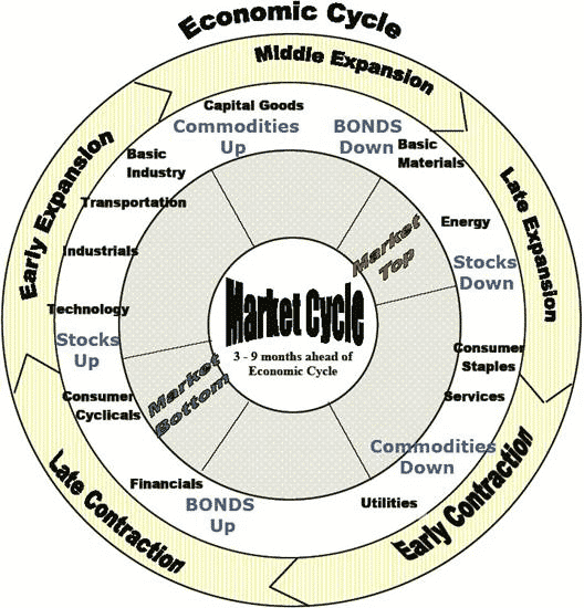
Source: http://www.nowandfutures.com (Global Business Cycles)
Each market cycle favors different industry sectors. The goal of a good working strategy is to choose the best performing sectors while avoiding or even shorting the worst performing sectors.
You can read the original strategy whitepaper for more details.
Methodology & Assets
U.S. industry sectors ETFs, their corresponding inverse or short sector ETFs and optional futures:
| U.S. Sector | ETF | Inverse (leverage) | Globex Futures |
| Materials | XLB | SMN (-2x) | IXB |
| Energy | XLE | ERY (-3x) | IXEe |
| Financial | XLF | SKF (-2x) | IXM |
| Industrials | XLI | SIJ (-2x) | IXI |
| Technology | XLK | REW (-2x) | IXT |
| Consumer Staples | XLP | SZK (-2x) | IXR |
| Real Estate | XLRE | SRS (-2x) | - |
| Utilities | XLU | SDP (-2x) | IXU |
| Health Care | XLV | RXD (-2x) | IXV |
| Consumer Discretionary | XLY | SCC (-2x) | IXY |
Statistics (YTD)
TotalReturn:
'Total return, when measuring performance, is the actual rate of return of an investment or a pool of investments over a given evaluation period. Total return includes interest, capital gains, dividends and distributions realized over a given period of time. Total return accounts for two categories of return: income including interest paid by fixed-income investments, distributions or dividends and capital appreciation, representing the change in the market price of an asset.'
Applying this definition to our asset in some examples:- The total return, or performance over 5 years of US Sector Rotation Strategy is 61.6%, which is smaller, thus worse compared to the benchmark SPY (111.6%) in the same period.
- During the last 3 years, the total return is 14.1%, which is lower, thus worse than the value of 68% from the benchmark.
CAGR:
'The compound annual growth rate (CAGR) is a useful measure of growth over multiple time periods. It can be thought of as the growth rate that gets you from the initial investment value to the ending investment value if you assume that the investment has been compounding over the time period.'
Which means for our asset as example:- Compared with the benchmark SPY (16.2%) in the period of the last 5 years, the annual return (CAGR) of 10.1% of US Sector Rotation Strategy is smaller, thus worse.
- During the last 3 years, the annual performance (CAGR) is 4.5%, which is smaller, thus worse than the value of 19% from the benchmark.
Volatility:
'In finance, volatility (symbol σ) is the degree of variation of a trading price series over time as measured by the standard deviation of logarithmic returns. Historic volatility measures a time series of past market prices. Implied volatility looks forward in time, being derived from the market price of a market-traded derivative (in particular, an option). Commonly, the higher the volatility, the riskier the security.'
Using this definition on our asset we see for example:- Looking at the volatility of 12.1% in the last 5 years of US Sector Rotation Strategy, we see it is relatively lower, thus better in comparison to the benchmark SPY (17.5%)
- Looking at historical 30 days volatility in of 10.3% in the period of the last 3 years, we see it is relatively lower, thus better in comparison to SPY (17.5%).
DownVol:
'Downside risk is the financial risk associated with losses. That is, it is the risk of the actual return being below the expected return, or the uncertainty about the magnitude of that difference. Risk measures typically quantify the downside risk, whereas the standard deviation (an example of a deviation risk measure) measures both the upside and downside risk. Specifically, downside risk in our definition is the semi-deviation, that is the standard deviation of all negative returns.'
Which means for our asset as example:- The downside deviation over 5 years of US Sector Rotation Strategy is 8.7%, which is lower, thus better compared to the benchmark SPY (12.1%) in the same period.
- Looking at downside risk in of 7.3% in the period of the last 3 years, we see it is relatively smaller, thus better in comparison to SPY (11.5%).
Sharpe:
'The Sharpe ratio (also known as the Sharpe index, the Sharpe measure, and the reward-to-variability ratio) is a way to examine the performance of an investment by adjusting for its risk. The ratio measures the excess return (or risk premium) per unit of deviation in an investment asset or a trading strategy, typically referred to as risk, named after William F. Sharpe.'
Which means for our asset as example:- Looking at the risk / return profile (Sharpe) of 0.63 in the last 5 years of US Sector Rotation Strategy, we see it is relatively smaller, thus worse in comparison to the benchmark SPY (0.78)
- Compared with SPY (0.94) in the period of the last 3 years, the ratio of return and volatility (Sharpe) of 0.19 is smaller, thus worse.
Sortino:
'The Sortino ratio, a variation of the Sharpe ratio only factors in the downside, or negative volatility, rather than the total volatility used in calculating the Sharpe ratio. The theory behind the Sortino variation is that upside volatility is a plus for the investment, and it, therefore, should not be included in the risk calculation. Therefore, the Sortino ratio takes upside volatility out of the equation and uses only the downside standard deviation in its calculation instead of the total standard deviation that is used in calculating the Sharpe ratio.'
Applying this definition to our asset in some examples:- The ratio of annual return and downside deviation over 5 years of US Sector Rotation Strategy is 0.87, which is lower, thus worse compared to the benchmark SPY (1.14) in the same period.
- Compared with SPY (1.43) in the period of the last 3 years, the downside risk / excess return profile of 0.28 is lower, thus worse.
Ulcer:
'The ulcer index is a stock market risk measure or technical analysis indicator devised by Peter Martin in 1987, and published by him and Byron McCann in their 1989 book The Investors Guide to Fidelity Funds. It's designed as a measure of volatility, but only volatility in the downward direction, i.e. the amount of drawdown or retracement occurring over a period. Other volatility measures like standard deviation treat up and down movement equally, but a trader doesn't mind upward movement, it's the downside that causes stress and stomach ulcers that the index's name suggests.'
Applying this definition to our asset in some examples:- Looking at the Downside risk index of 6.38 in the last 5 years of US Sector Rotation Strategy, we see it is relatively lower, thus better in comparison to the benchmark SPY (8.48 )
- Looking at Downside risk index in of 4.74 in the period of the last 3 years, we see it is relatively lower, thus better in comparison to SPY (5.31 ).
MaxDD:
'Maximum drawdown is defined as the peak-to-trough decline of an investment during a specific period. It is usually quoted as a percentage of the peak value. The maximum drawdown can be calculated based on absolute returns, in order to identify strategies that suffer less during market downturns, such as low-volatility strategies. However, the maximum drawdown can also be calculated based on returns relative to a benchmark index, for identifying strategies that show steady outperformance over time.'
Using this definition on our asset we see for example:- The maximum reduction from previous high over 5 years of US Sector Rotation Strategy is -16.4 days, which is greater, thus better compared to the benchmark SPY (-24.5 days) in the same period.
- Looking at maximum drop from peak to valley in of -11.7 days in the period of the last 3 years, we see it is relatively greater, thus better in comparison to SPY (-18.8 days).
MaxDuration:
'The Drawdown Duration is the length of any peak to peak period, or the time between new equity highs. The Max Drawdown Duration is the worst (the maximum/longest) amount of time an investment has seen between peaks (equity highs). Many assume Max DD Duration is the length of time between new highs during which the Max DD (magnitude) occurred. But that isn’t always the case. The Max DD duration is the longest time between peaks, period. So it could be the time when the program also had its biggest peak to valley loss (and usually is, because the program needs a long time to recover from the largest loss), but it doesn’t have to be'
Using this definition on our asset we see for example:- Looking at the maximum days below previous high of 507 days in the last 5 years of US Sector Rotation Strategy, we see it is relatively greater, thus worse in comparison to the benchmark SPY (488 days)
- During the last 3 years, the maximum days below previous high is 268 days, which is greater, thus worse than the value of 199 days from the benchmark.
AveDuration:
'The Drawdown Duration is the length of any peak to peak period, or the time between new equity highs. The Avg Drawdown Duration is the average amount of time an investment has seen between peaks (equity highs), or in other terms the average of time under water of all drawdowns. So in contrast to the Maximum duration it does not measure only one drawdown event but calculates the average of all.'
Using this definition on our asset we see for example:- Looking at the average time in days below previous high water mark of 140 days in the last 5 years of US Sector Rotation Strategy, we see it is relatively greater, thus worse in comparison to the benchmark SPY (120 days)
- Compared with SPY (47 days) in the period of the last 3 years, the average time in days below previous high water mark of 86 days is larger, thus worse.
Performance (YTD)
Allocations and holdings shown below are delayed by one month.
Register now to get the current trading allocations.
Allocations ()
Returns (%)
- Note that yearly returns do not equal the sum of monthly returns due to compounding.
- Performance results of US Sector Rotation Strategy are hypothetical and do not account for slippage, fees or taxes.
- Results may be based on backtesting, which has many inherent limitations, some of which are described in our Terms of Use.